Data Source: This analysis is based on the 2016 Census of Population conducted by Statistics Canada, with neighborhood-level profiles accessed via the City of Toronto’s Open Data Catalogue.
Principal Component 1 (PC1): Deprivation Gradient
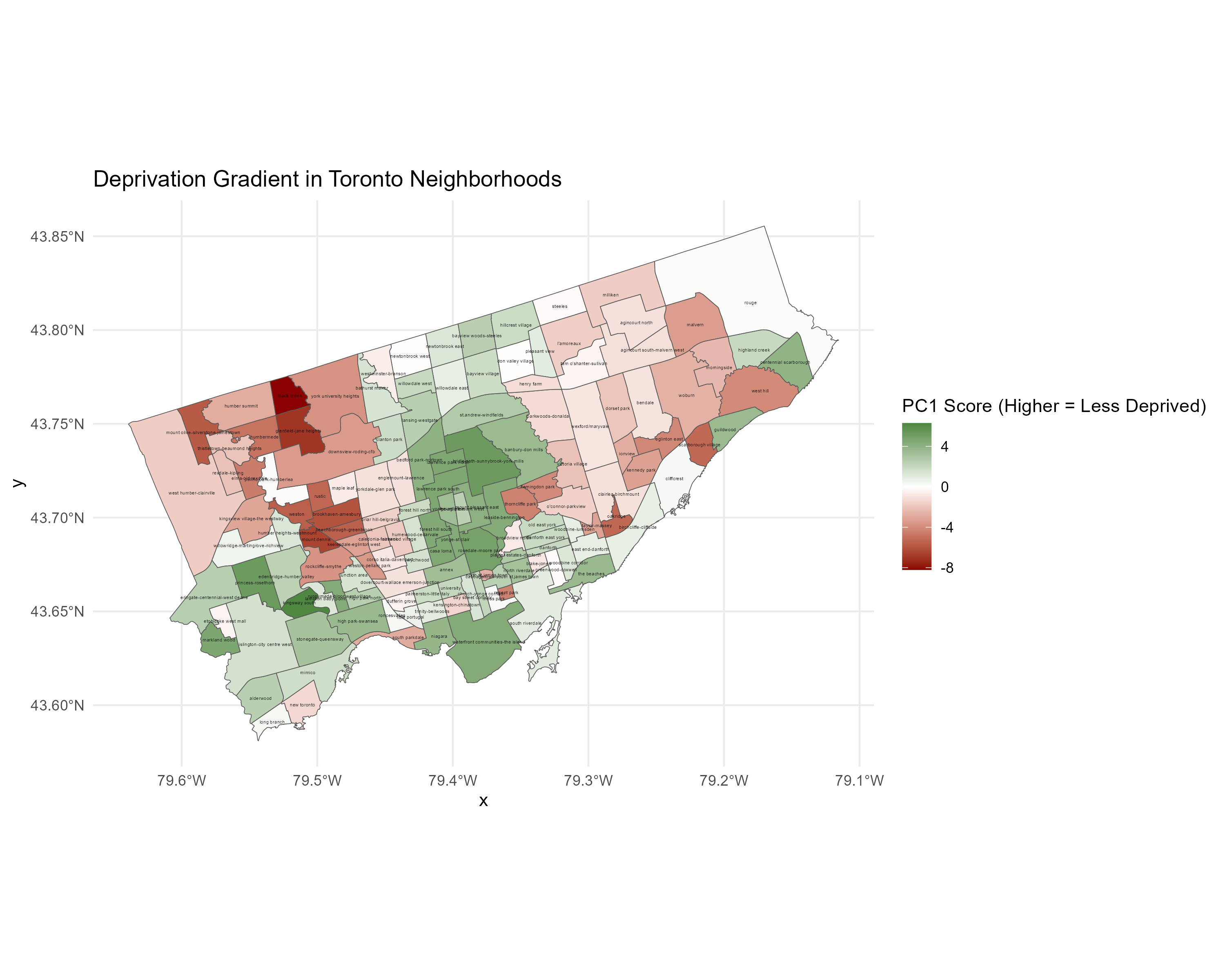
Interpretation
Principal Component 1 (PC1) captures a socioeconomic status (SES) deprivation index. High positive loadings = greater poverty, marginalization. High negative loadings = greater wealth, education, housing quality.
- Top positive contributors (more deprived):
- Welfare rate (
Welfare_pct) = 0.309 - Lone-parent households (
LoneParent_pct) = 0.298 - No education (
Education_No_pct) = 0.284 - Unemployment = 0.270
- Visible minorities = 0.240
- Homes needing major repairs = 0.205
- Welfare rate (
- Top negative contributors (more privileged):
- High income > $100k = –0.287
- Upper-middle income = –0.285
- Postsecondary education = –0.196
- Fewer low-value homes = –0.149
Spatial Distribution of Deprivation
- High Deprivation (Red areas):
- Northwest: Humbermede, Weston, Mount Olive
- Eastern Scarborough
- Low Deprivation (Green areas):
- Midtown and The Annex
- Waterfront neighborhoods
Conclusion: Wealth Allocation Disparities
Toronto exhibits entrenched spatial inequality:
- Wealth clusters in central & southern areas
- Deprivation pushed to the city’s edges
This local SES pattern aligns with national findings (e.g., Chakraborty et al., 2020).
Principal Component 2 (PC2): Skilled but Strained
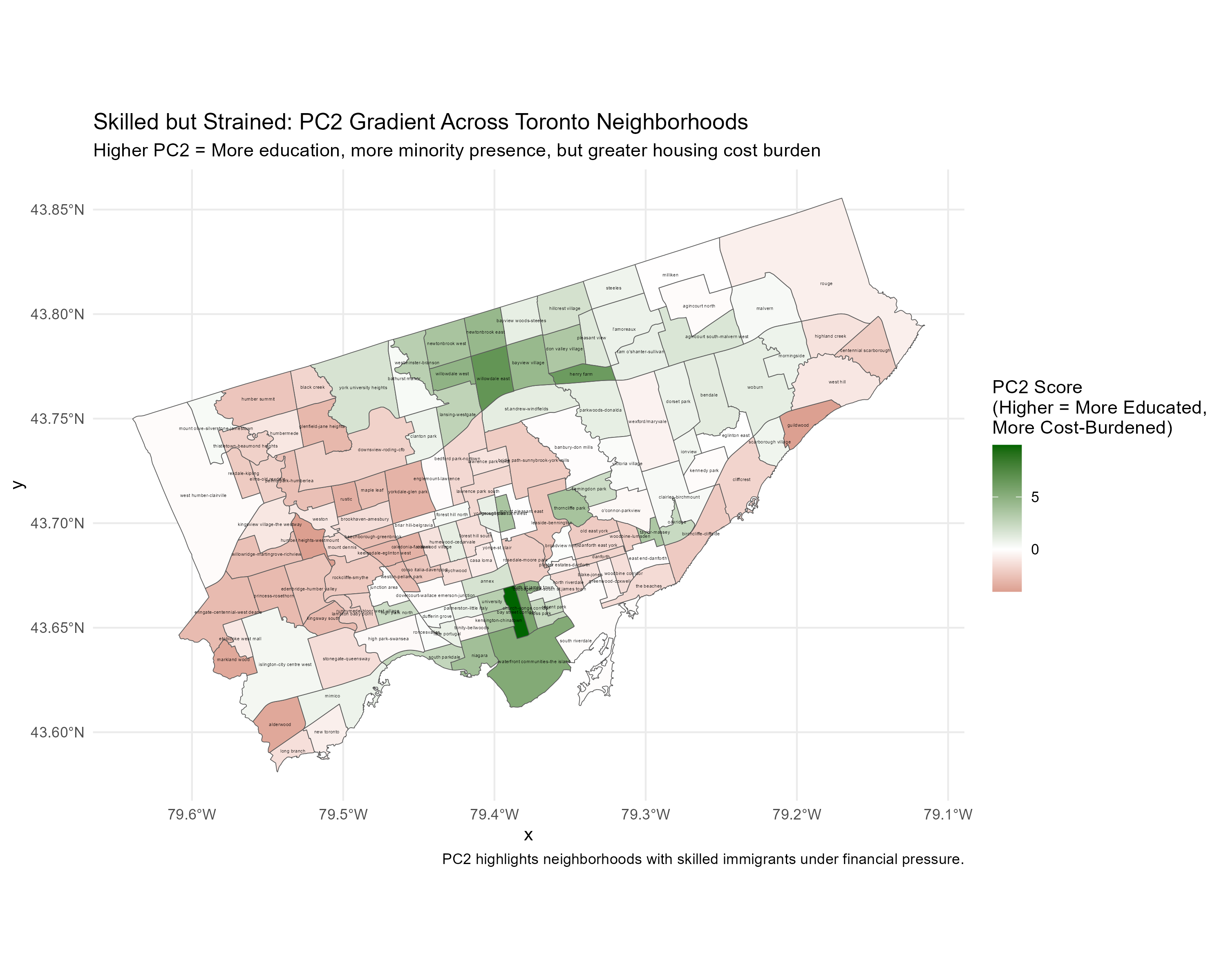
Interpretation
PC2 contrasts:
- Younger, highly educated populations
- Older, moderate-income, less-educated populations
- High PC2 Scores (Green):
- Math/science/professional education
- Higher-value homes
- Population growth
- Some low-income residents
- Low PC2 Scores (Red):
- Older residents (55+ years)
- Moderate incomes ($30k–$80k)
- Lower education
Education vs. Income Strain
Green areas = skilled professionals still under financial pressure. May reflect student debt, rising rent, or delayed returns on education.
Strained Professionals vs. Aging Affordability
- One side: High education + high costs
- Other side: Older populations + affordable homes but lower mobility
Final Reflection
This analysis is part of a learning journey into spatial socioeconomic analysis using principal component methods. It follows a growing research tradition, including Chakraborty et al. (2020), that uses PCA to build multidimensional SES indices. Here, PCA has uncovered meaningful spatial divides within Toronto that reflect economic, educational, and demographic inequality.
This project is not a policy proposal. It is a data-driven exploration aimed at uncovering the hidden structure of urban life in Toronto using publicly available data. I encourage feedback, critical questions, and reflections from others to improve this work and expand it into multivariate analysis.
I’ll be sharing this with my team.